|
A Line chart is used to analyze ups and downs of a tendency in a range of values. You can define it with one series of values where you will judge the evolution of an item over a period. When used with more than one series, this chart can
be very helpful in comparing values of the same category over the same period.
The Line chart can also be used to analyze values that don't share the same periodic variable. For example, you can use it to compare library attendance with regard to the real population number (which could be in hundreds of thousands or millions) with the number of people attending the library. In the latter situation, if the same
axes are used to analyze, one category will almost disappear from the chart. The alternative is to separate their axis on the same
chart.
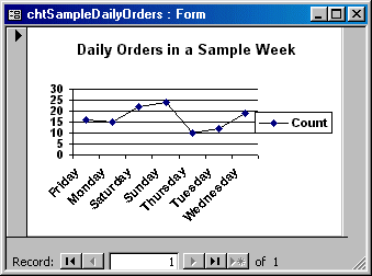
In the following chart, we are picking a sample week of the year. We then
isolate the names of weekdays to evaluate the tendency of customers orders. What
we want to know is what days produce more orders and what days are slow. This
type of information can help the management decide what days they need more
cashiers because there are more customers. On the slow days of the week, the
business doesn't need many employees, at least not too many cashiers serving
customers.
To prepare data to be used, we will create a query that uses the dates
orders are placed. Fortunately, we also have a column that evaluates weekdays.
This second column will be the actual source of data for the chart. The first
column allows us to specify the criteria, which consists of considering only one
week as our sample.
 Practical Learning: Creating a Line Chart
|