 |
Formatting Charts |
|
The Sections of a Chart
Introduction
As mentioned already, to present its information and explain it, a chart is made or various sections.

Most or everyone of these aspects can be hidden, displayed or changed. To perform any action on these parts, after displaying the form or report that holds the chart in Design View, you can double-click the chart. Then, in Microsoft Graph, click or right-click the desired part.
The Title of a Chart
To indicate what it is used for, a chart can be equipped with a title. The title is a string that typically displays in the top section of a chart. In some rare cases, a title can also be positioned under the chart. To move the title, click and drag it in the desired direction.
To format the title, you can either double-click it or right-click it and click Format Chart Title. By default, the chart displays without a border, in bold Arial. You change reformat it using the Format Chart Title dialog box.
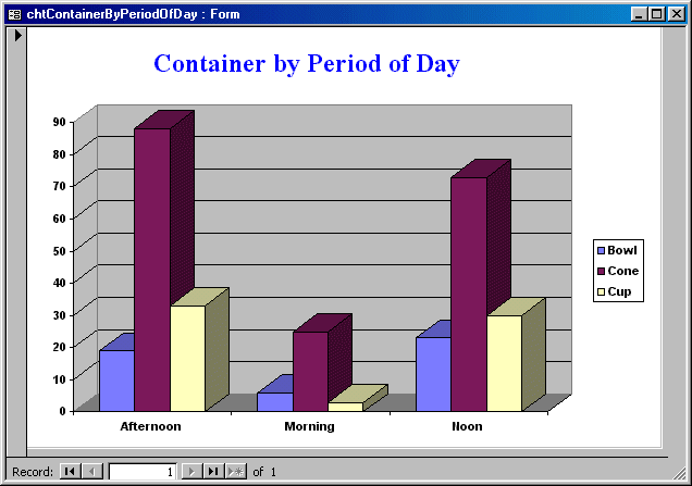
 Practical Learning: Formatting a Chart's Title
- From the Forms section of the Database window,
double-click the chtContainerByPeriodOfDay form and switch it to
Design View
- Double-click the chart to open the Microsoft Graph window
and enlarge the window that contains the chart
- Right-click the Container by Period of Day title and
click Format Chart Title...
- In the Format Chart Title dialog box, click the Font
property page
- In the Font combo box, select Times New Roman
- In the Size combo box, select 18
- Click arrow of the Color combo box and select Blue
- Click OK
- Close the Microsoft Graph window
- Adjust the chart to fit the form
- Save and close the form
- Right-click the chtFlavorFrequency form and click Design
View
- Double-click the chart to open Microsoft Graph
- Click the title on top twice (that is, click it and click
it again; not double-click) to put it into edit mode
- Edit it to display PercentageOrdered
- Click between Percentage and Ordered then press Enter to
create a new line
- Click somewhere else to deselect
- Move the title to the top left section and double-click
it. Change its font to Haettenschweiler, Bold, 14, Red
and click OK
Chart Figures
To represent its numbers to the user, a chart draws
some geometric figures, depending on the type of chart. These figures can
be rectangles, pie slices, triangles, cones, etc. By default, the chart
engine uses some randomly selected colors from its own list. You can
either change these colors or apply some preset drawings available. You
can also design and use any custom picture to paint the chart's shapes.
To
format the geometric figures of a chart, you can right-click one of them
and click Format Data Series.
 Practical Learning: Formatting a Chart's Shapes
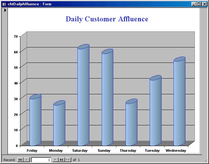
- Open the chtDailyAffluence form and switch it to Design View
- Double-click the chart to open the Microsoft Graph window
- Right-click the most left cylinder and click Format Data Series
- In the Format Series dialog box, make sure the Patterns property
page is selected. In the Border section, make sure the Custom radio
button is selected. click the arrow of the Color combo box and click
Blue (5th column - 1st row)
- Click the arrow of the Weight combo box and click the 2nd option
- In the Area section, click the Pale Blue color (1st section - 6th
column - 5th row)
- Click OK
- Close Microsoft Graph
- Preview the chart
- Save and close the form
- Open the chtContainerByPeriodOfDay form and switch it to Design View
- Double-click the chart to Open Microsoft Graph
- Right-click the most left rectangular box and click Format Data
Series
- In the Format Data Series dialog box, make sure the Patterns
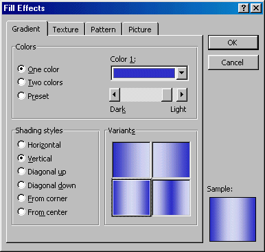
property page is selected. In the Area section, click Fill Effects...
- In the Gradient property page of the Fill Effects dialog box, in the
Colors section, click the One Color radio button
- In the Color 1 section, drag to thumb of the slider to the right
- In the Shading section, click the Vertical radio button
- In the Variants section, click the box on 1st column - 2nd row
- Click OK
- Save the form and preview the chart
- Print the form
- Close the form
|
When a chart draws its graphics, if the data is made of
different types of values, the chart engine uses a different column for each
type of value to differentiate them. Because this can become confusing, a
small box is created as a guide. This box, by default displayed to the right
of the chart, is called a legend.
In the legend, a small painted square displays a color
and a label on its right. The color is one of the colors used on the
graphics of the chart. The label indicates what that part represents
|
 Practical Learning: Using a Chart's Legend
|
- Right-click the chtDailyAffluence form and click Design View
- Double-click the chart to open Microsoft Graph
- Click the box that has 1st Qtr and press Delete
- Close Microsoft Graph and preview the chart
- Print then close the form
- Right-click the chtFlavorFrequency form and click Design View
- Double-click the chart to open Microsoft Graph
- Click the box that displays East West North and press Delete
- Right-click the chart and click Format Data Series
- In the Format Data Series dialog box, click the Data Labels property
page
- In the Data Labels section, click the Show Label And Percent radio
button
- Click OK and position the chart to the center of the window
- Close Microsoft Graph
- Adjust the chart to your liking and preview it
- Save and print the form
- Close the form
|
|
By default, when a chart is drawn, it is equipped with
shapes and a separate legend. If you want, you can display the value of
each part and possibly its name close to it. This is done through a label.
On a large chart, a label can also be used in the absence of a legend. In
fact, you can delete a legend and simply make use of a label.
Labels are created using the same approach as we have
done with the legends and titles. |
 Practical Learning: Adding Labels to a Chart
|
- Right-click the chtFlavorFrequency form and click Design View
- Double-click the chart to open Microsoft Graph
- Click the box that displays East West North and press Delete
- Right-click the chart and click Format Data Series
- In the Format Data Series dialog box, click the Data Labels property
page
- In the Data Labels section, click the Show Label And Percent radio
button
- Click OK and position the chart to the center of the window
- Close Microsoft Graph
- Adjust the chart to your liking and preview it
- Save and print the form then close it
|
|
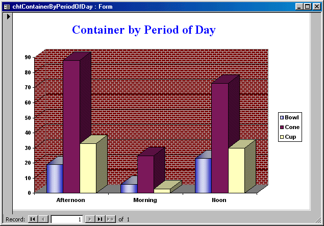
The wall is in fact the background of a chart. By
default, it is painted either white or gray, depending on the chart. You
can use a different color to paint it, a design pattern or a picture to
cover it. |
 Practical Learning: Formatting a Chart's Walls
|
- Right-click the chtContainerByPeriodOfDay form and click Design View
- Double-click the chart to open Microsoft Graph
- In the chart, right-click the gray area and click Format Walls...
- In the Format Walls dialog box, in the Area section, click Fill
Effects
- In the Fill Effects dialog box, click the Pattern property page
- In the Pattern section, click the box in 6th column - 4th row
- Set the Foreground to Gray-25% (8th column - 4th row)
- Set the Background to Dark Red (1st column - 2nd row)
- Click OK twice
- Save and print then close the form
- Right-click the chtDailyAffluence form and click Design View
- Double-click the chart to open Microsoft Graph
- Right-click the gray area and click Format Walls...
- Click Fill Effects and click the Texture property page
- In the Texture section, click the box in the 4th column - 1st row
and click OK twice
- Right-click the bottom gray area and click Format Floor...
- Click Fill Effects... and click Texture
- Click the box in 2nd column - 2nd row and click OK twice
- Close Microsoft Graph and preview the chart

- Save the form
- Print and close the form
|


![]() Practical Learning: Formatting a Chart's Title
Practical Learning: Formatting a Chart's Title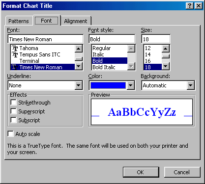

![]() Practical Learning: Formatting a Chart's Shapes
Practical Learning: Formatting a Chart's Shapes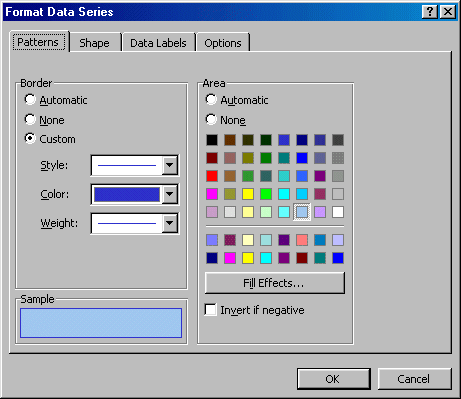
![]() Practical Learning: Using a Chart's Legend
Practical Learning: Using a Chart's Legend![]() Practical Learning: Adding Labels to a Chart
Practical Learning: Adding Labels to a Chart![]() Practical Learning: Formatting a Chart's Walls
Practical Learning: Formatting a Chart's Walls