|
 Practical
Learning: Anchoring the Controls Practical
Learning: Anchoring the Controls
|
|
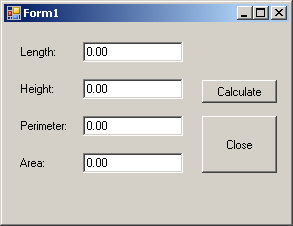
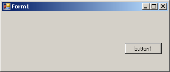
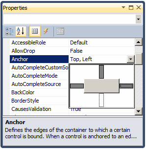
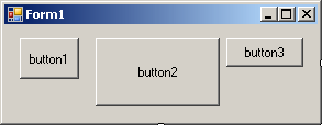
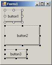
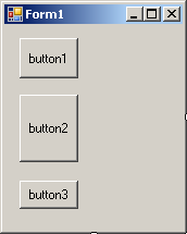
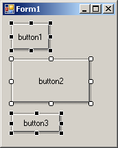
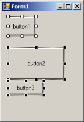
- On the form, select the buttons on the right side:
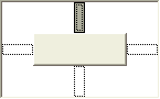
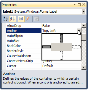
- In the Properties window, click Anchor and click the arrow of its
combo box
- Click the top vertical line and the right horizontal line. Click the
left horizontal line to clear it:

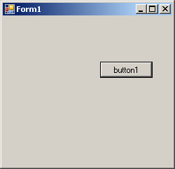
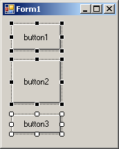
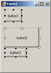
- On the form, select all text boxes
- In the Properties window, click Anchor and click the arrow of its
combo box. Click the right horizontal line and keep the others
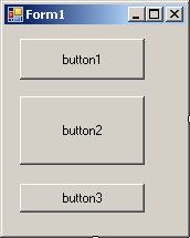
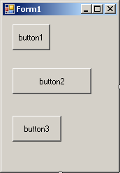
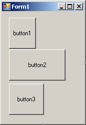
- Execute the application
- Resize it horizontally and vertically to see the result

- Close the form and return to your programming environment
When a control is added to a host, depending on the
control, it may be automatically positioned where the mouse landed. In some
cases, you will want the control to be attached to a border or to a corner
of its parent. This can be done using the Dock property:
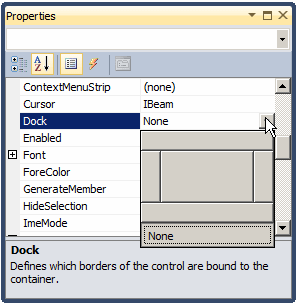
This property is managed through the DockStyle
enumerator. To use this property, click the control and, in the Properties
window, click the arrow of the Dock field. You can then select one of
the following values:
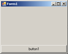
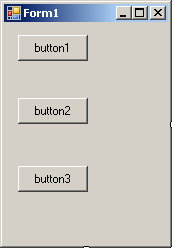
Bottom: The control will be attached to the
bottom border of its parent:
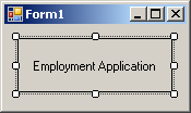
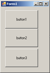
Fill: The control will use the whole client area
of its parent:
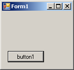
Left: The control will be attached to the left
border of its parent:
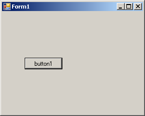
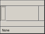
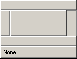
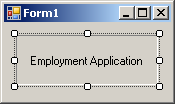
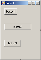
None: The control will be kept where it was
positioned on the parent:
Right: The control will be attached to the right
border of its parent:
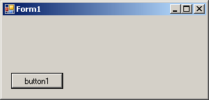
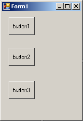
Top: The control will be attached to the top
border of its parent:
|
Practical
Learning: Docking a Control
|
|
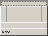
- On the Toolbox, click Panel
- On the form, click and hold the mouse somewhere in the lower-left
section. Then drag right and slightly up to draw it as follows (no need
for precision):

- While the panel control is still selected, in the Properties window,
click Dock and click the arrow of its combo box
- Select the box above None (to select Bottom)

|
Aesthetic Aspects of a Control
|
|
Controls used on Microsoft Windows are painted using a
color known as Control. If you don't like the default color that
paints the background of a control, you can access the BackColor
field of the Properties window:
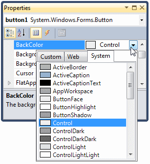
You can then select one of the preset colors from 3
windows represented with tabs.
|
Practical
Learning: Changing the Background Color of a Control
|
|
- On the form, click the bottom panel
- In the Properties window, click BackColor and click its arrow
- Click the Custom tab and click the color at 3rd column - 2nd row:
- Execute the application to test it
- Close the form and return to your programming environment
Instead of a color, you may want to fill the control
with a picture. To do this, you can access the control's BackgroundImage
property. This provides an ellipsis button you can use to locate and select
the desired picture.
Some controls display a border when they are drawn and
some others don't. Consider the following:
Some of these controls allow you to specify a type of
border you want to show surrounding the controls. This characteristic is
controlled by the BorderStyle property, which is based on
BorderStyle enumerator. Its members are:
|
Value |
Example |
| Fixed3D |
 |
| FixedSingle |
 |
| None |
 |
|
API Characteristics of Controls
|
|
A user can navigate through controls using the Tab key.
When that key has been pressed, the focus moves from one control to the
next. By their designs, not all controls can receive focus and not all
controls can participate in tab navigation. Even controls that can receive
focus must be primarily included in the tab sequence.
At design time, the participation to tab sequencing is
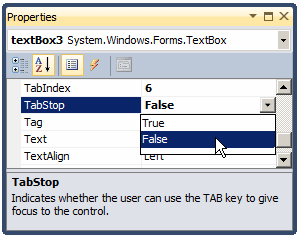
controlled by the Boolean TabStop property in the Properties window.
Every visual control that can receive f aocus is already configured to have
this property set to True. If you want to remove a control from this
sequence, set its TabStop value to False.
If a control has the TabStop property set to
True, to arrange the navigation order of controls, you have two main
options. At design time, you can click a control on the form. Then, on the
Properties window, change the value of its TabIndex field. The value
must be a positive short integer.
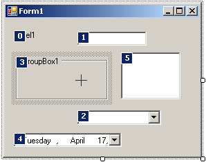
The best and easiest way to arrange the tab sequence of
controls is to manage it visually. To do this, first display the form. Then,
on the main menu, click View. This causes a number to be positioned on every
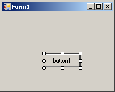
control of the form. Here is an example:
To arrange the sequence any way you like, click each
control once in the desired order. Normally, static controls (such as the
label, the picture box, the panel, etc) never receive focus when the
application is running; therefore, you can skip such controls.
|
Practical
Learning: Setting the Tab Order of Controls
|
|
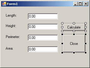
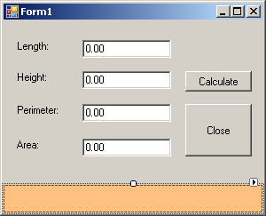
- Click anywhere in the form
- On the main menu, click View -> Tab Order
- On the form, click, in the following order, the text box on the
right side of Length, the text box on the right side of Height, the
Calculate button, and the Close button

- Press Esc to dismiss the Tab Order tool
- On the form, click the text box on the right side of Perimeter:
- In the Properties window, set the TabStop to False
- In the same way, set the TabStop property of the text box on the
right side of Area: to False
- Execute the application
- Press Tab a few times and observe the behavior
- Close the form and return to your programming environment
Microsoft Windows XP added a new feature to the way some
controls display or behave when the mouse passes over them, making the
controls significantly attractive and enhanced. This feature is neither
automatically applied on controls nor available on all controls. Therefore,
before using it, you must first find out if the control you want to use it
on support it. A control that supports this feature should have the
FlatStyle property. This property provides the following values:
-
Flat: The button appears flat. When the mouse
is over it, it becomes highlighted
-
Popup: The button appears flat. When the
mouse is over it, the borders of the button are raised (if you have used
WordPerfect, you may have seen this effect)
-
Standard: The buttons appears and behave like
all regular buttons you have seen
-
System: The appearance of the button depends
on the operating system using it
If the application will be run on Windows XP, you can
use the System value of the FlatStyle property. To make this
style work, call the Application.EnableVisualStyles() method in the
Main() method as follows:
int APIENTRY WinMain(HINSTANCE hInstance,
                     HINSTANCE hPrevInstance,
                     LPSTR    lpCmdLine,
                     int       nCmdShow)
{
    System::Threading::Thread::CurrentThread->ApartmentState =
		System::Threading::ApartmentState::STA;
    Application::EnableVisualStyles();

    Application::Run(new Form1());
    return 0;
}
|
Practical
Learning: Using Flat Styles
|
|
- On the form, select both the Calculate and the Close buttons
- In the Properties window, click FlatStyles and click the
arrow of its combo box
- Select System
- In the Solution Explorer, expand the Source Files node if necessary.
Double-click Form1.cpp
- Change the WinMain() function as follows:
int APIENTRY WinMain(HINSTANCE hInstance,
                     HINSTANCE hPrevInstance,
                     LPSTR    lpCmdLine,
                     int       nCmdShow)
{
    System::Threading::Thread::CurrentThread->ApartmentState =
	System::Threading::ApartmentState::STA;

    Application::EnableVisualStyles();

    Application::Run(new Form1());
    return 0;
}
- Execute the application
- Close the form and return to your programming environment
A control is referred to as visible if it can be
visually located on the screen. A user can use a control only if he or she
can see it. As a programmer, you have the role of deciding whether a control
must be seen or not and when. The visibility of an object is controlled by
the its Visible property. This is a Boolean property.
At design time, when you add a control to a parent, it
is visible by default. This is because its Visible property is set to
True in the Properties window. In the same way, if you
programmatically create a control, by default, it is made visible once you
add it to its parent's Controls property.
If you don't want a control to primarily appear when the
form comes up, you can either set its Visible property to False
or set its parent's visible property to False. Equivalently, at run
time, to hide a control, assign a False value to either its
Visible property or its parent's Visible property. Keep in mind
that when a parent gets hidden, it also hides its children. On the other
hand, a parent can be made visible but hide one or some of its children.
To check whether a control is visible at one time, apply
a conditional statement (if or while) to its Visible
property and check whether its value is True or False. In the
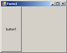
following example, when the user clicks a button named button1, a text box
named textBox1 gets hidden.
For the user to use a control, it must allow operations
on it. For example, if a control is supposed to receive text, the user can
enter characters in it only if this is made possible. To make a control
available to the user, the object must be enabled. The availability of an
object is controlled by the Boolean Enabled property.
By default, after adding a control to a form, it is
enabled and its Enabled property in the Properties window is set to
True. An enabled control displays its text or other characteristics
in their normal settings. If you want to disable a control, set its
Enabled property to False. In the following picture, a text box
and a button are disabled:

To find out whether a control is enabled or not, check
its Enabled property state.
|
Allowing Drag n' Drop
Operations
|
|
Drag n' drop is the ability to drag an object or text
from one location or object to another. This is a significant operation in
computer use. Although Microsoft Windows fully supports drag n' drop
operations, because the operating system cannot predict how the operations
should be carried, you must write code.
Various controls support drag n' drop operations. While
most controls support them, it is not always realistic to implement the
operations on every control. This means that you will have to decide when,
how, and what controls of your application will need to allow the user do
drag what and drop it where.
A control that allows drag n' drop operations is
equipped with a Boolean property named AllowDrop. When you set this property
to true, it means the user can either drag something from it or drop
something on it. After setting this property, you must write code. We will
see examples in future lessons.
|
|


