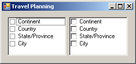
 A checked list box combines the functionalities of the list box and the check box controls. As a list box, it displays each of its items on a line. If there are too many items than the control can display, it would be equipped with a vertical scroll bar. To select an item in the list, the user can click the desired string. The most important and obvious characteristic of the checked list box is that each item displays a check box on its left. This box allows the user to select or deselect each item. To select an item, the user must click its box and not its string, to indicate an explicit selection. This draws a check mark in the box. As described with the check box control, the user can deselect an item by removing the check mark. The check mark indicates that an item is selected and the absence of the check mark indicates the contrary. Like the check box control, you can allow the user to indicate a "half-checked" item. In this case, a check box can appear unchecked, checked, or grayed.
To support checked list boxes, the .NET Framework
provides the CheckedListBox class. At design time, to add a checked
list box to your application, from the Common Controls section of the
Toolbox, click the CheckedListBox button
#include <windows.h>

#using <System.dll>
#using <System.Drawing.dll>
#using <System.Windows.Forms.dll>

using namespace System;
using namespace System::Drawing;
using namespace System::Windows::Forms;

public ref class CExercise : Form
{
private:
    CheckedListBox ^ lbxPersonalRelationships;

public:
	CExercise()
    {
        InitializeComponent();
    }

private:
    void InitializeComponent()
    {
        lbxPersonalRelationships = gcnew CheckedListBox;
        lbxPersonalRelationships->Location = Point(12, 12);

	Text = "Checked List Box";
        Controls->Add(lbxPersonalRelationships);
    }
};

[STAThread]
int APIENTRY WinMain(HINSTANCE hInstance,
		     HINSTANCE hPrevInstance,
		     LPSTR lpCmdLine,
		     int nCmdShow)
{
    Application::Run(gcnew CExercise);

    return 0;
}
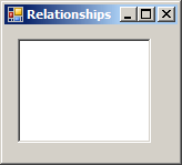
This would produce:
The CheckedListBox class is derived from the ListBox class. This means that the checked list box possesses all the public (and protected) characteristics of the list box and its parent the ListControl class. This control also uses the HorizontalScrollbar and the HorizontalExtent properties that behave exactly as we reviewed for the list box. It also uses the SelectionMode property with the same behavior as that of the list box.
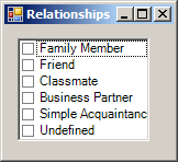
As seen for the list box, the primary aspect of a checked list box is its list of items. At design time, to create the list of items of a checked list box, access its Properties window, and click the ellipsis button to open the String Collection Editor. Type each item followed by a carriage return. After creating the list, click OK. To programmatically create the list of items, access the Items property. The list is created from the nested ObjectCollection class that implements the IList, the ICollection, and the IEnumerable interfaces. This means that the CheckedListBox::ObjectCollection class behaves the same as the ListBox::ObjectCollection class. Here is an example: void InitializeComponent()
{
lbxPersonalRelationships = gcnew CheckedListBox;
lbxPersonalRelationships->Location = Point(12, 12);
lbxPersonalRelationships->Items->Add("Family Member");
lbxPersonalRelationships->Items->Add("Friend");
lbxPersonalRelationships->Items->Add("Classmate");
lbxPersonalRelationships->Items->Add("Business Partner");
lbxPersonalRelationships->Items->Add("Simple Acquaintance");
lbxPersonalRelationships->Items->Add("Undefined");
Text = "Relationships";
Controls->Add(lbxPersonalRelationships);
}
This would produce:
Remember that you can also add an array of items by calling the AddRange() and you can insert an item using the Insert() member function.
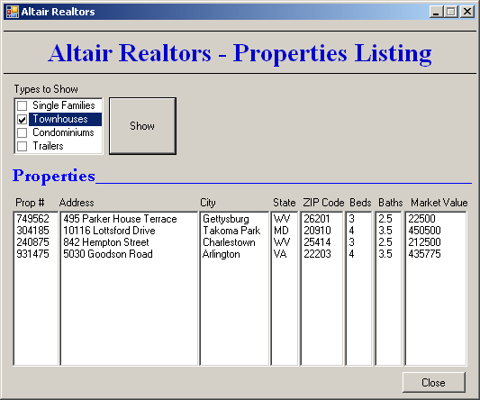
As mentioned already, the main difference between a list box and a checked list is the presence of check marks in the former. When using the control, the user can click one or more check boxes. Here is an example:
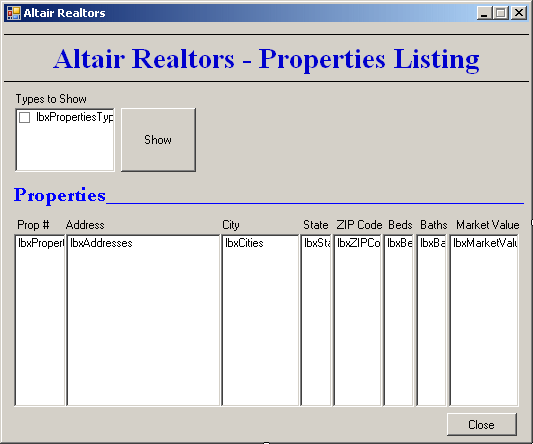
After the user has clicked a few check boxes, you may want to find out which ones are checked. The checked list box provides two techniques you can use. As seen for the list box, each item of the control has an index. When one, a few, or all items have been checked (those that display a check mark), the indices of the checked items are stored in a collection represented by the CheckedIndices property. This property is based on the nested CheckedIndexCollection collection class. The CheckedIndexCollection class implements the IList, the ICollection, and the IEnumerable interfaces. The identifications of the checked items are stored in a collection represented by the CheckedItems property. This property is based on the nested CheckedItemCollection class. The CheckedItemCollection class implements the IList, the ICollection, and the IEnumerable interfaces. This implies that you can use it to get the number of selected items. When the user has clicked item to put a check mark on it, the control fires the ItemCheck event. Its formula is: System::Void lbxPropertiesTypes_ItemCheck(Object ^ sender, ItemCheckEventArgs ^ e)
{
}
As you can see, the event is carried by the ItemCheckEventArgs class. One of the most important operations to perform on a list of selected items is to find out whether a particular item is checked. To get this information, the CheckedItemCollection class provides a member function named Contains. Its syntax is: public:
virtual bool Contains(Object^ item) sealed;
This member function takes as argument a value that can identify an item from the checked list box. If the item is found and it is checked, this member function returns true. Otherwise, it returns false. |
|
||||||||||||||||||||||||||||||||||||||||||||||||||||||||||||||||||||||||||||||||||||||||||||||||||||||||||||||||||||||||||||||||||||||||||||||||
|
|
|||||||||||||||||||||||||||||||||||||||||||||||||||||||||||||||||||||||||||||||||||||||||||||||||||||||||||||||||||||||||||||||||||||||||||||||||

