.NET Controls: Progress Bars
 |
.NET Controls: Progress Bars |
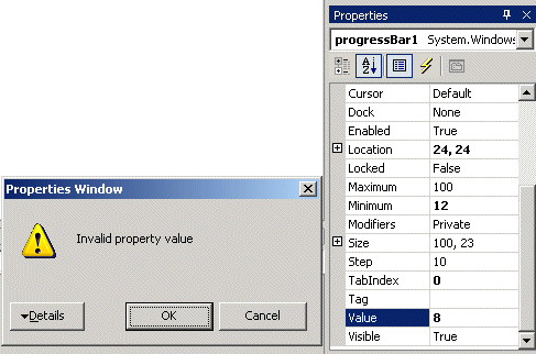
After adding it to an application, a progress bar assumes a horizontal position (the actual progress bar of Microsoft Windows, as implemented in Win32, can also have a vertical orientation; the .NET Framework's version has this and other limitations). To show its effect, the progress bar draws its small rectangles as a bar. These small rectangles are from a starting position to an end. This means that the progress bar uses a range of values. This range is controlled by the Minimum and the Maximum properties whose default values are 0 and 100 respectively. At design time, you can set them using integer values. The small rectangles are drawn from the left (the Minimum value) to the right (the Maximum value) sides of the control. At one particular time, the most right rectangle of a progress bar is referred to as its position and it is represented by the Value property. At design time, to set a specific position for the control, change the value of the Value property whose default is 0. The position must always be between the Minimum and Maximum values. At design time, if you change the Minimum to a value higher than the Value property, the value of Value would be increased to the new value of Minimum. If you set the value of Value to a value lower than the Minimum, You would receive an error:  After clicking OK, the value of the Minimum would be reset to that of the Value property. In the same way, if you set the value of Value to a value higher than Maximum, you would receive an error. At run time, you can assign the desired value to the Value property. Once again, avoid specifying a value that is out of range. Because a progress bar is usually meant to indicate the progress of an activity, when drawing its small rectangles, it increases its current position in order to draw the next rectangle, except if the control is reset. The number of units that the control must increase its value is controlled by the Step property. By default, it is set to 10. Otherwise, you can set it to a different value of your choice. When the control draws one of its rectangles based on the Step value, it calls the PerformStep(). Its syntax is: public: void PerformStep(); After a small rectangle has been drawn, the current value is incremented by the value of the Step property. If you want to increment the value of the control to a value other than that of the the Step property, then call the Increment() method. Its syntax is: public: void Increment(int value); The amount by which to increment is passed to the method. |
|
|
|
||
| Home | Copyright © 2004-2010 FunctionX, Inc. | |
|
|
||